chromo-map Jupyter Integration Demo
This notebook demonstrates chromo-map’s rich visual integration with Jupyter notebooks. You’ll see how colors, gradients, and swatches automatically display with beautiful visual representations, making color exploration and manipulation highly interactive.
Key Features Demonstrated:
Rich Color Display: Colors show as colored squares with hover information
Gradient Visualization: Smooth color transitions displayed as horizontal bars
Swatch Organization: Multiple gradients arranged in organized grids
Interactive Exploration: Real-time visual feedback for color manipulations
Professional Palettes: Visual access to Plotly, matplotlib, and Palettable color schemes
1. Import Required Libraries
First, let’s import chromo-map and any additional libraries needed for this demonstration.
[1]:
# Import chromo-map classes
from chromo_map import Color, Gradient, Swatch, cmaps
import numpy as np

# For this demo, we'll focus on chromo-map's built-in Jupyter visualization
# No additional plotting libraries needed - chromo-map handles the display!

print("✅ chromo-map imported successfully!")
print(f"📊 Total available gradients: {len(cmaps.all)}")
print(f"🎨 Plotly gradients: {sum(len(cat) for cat in cmaps.plotly_by_type.values())}")
print(f"🔬 Matplotlib gradients: {sum(len(cat) for cat in cmaps.matplotlib_by_type.values())}")
print(f"🎭 Palettable gradients: {sum(len(cat) for cat in cmaps.palettable_by_type.values())}")
✅ chromo-map imported successfully!
📊 Total available gradients: 244
🎨 Plotly gradients: 212
🔬 Matplotlib gradients: 83
🎭 Palettable gradients: 186
2. Basic Color Display in Jupyter
In Jupyter notebooks, chromo-map Color objects automatically display as beautiful colored squares with detailed information. Just create a color and put it as the last line of a cell!
[2]:
# Create a vibrant orange color
vibrant_orange = Color('#ff6b35')
vibrant_orange  # This will display as a colored square with hover info!
[2]:
[3]:
# Let's create several colors using different input methods
colors = [
    Color('#3498db'),           # Hex string (blue)
    Color('forestgreen'),       # Named color
    Color('rgb(255, 107, 53)'),      # RGB tuple (orange)
    Color((0.8, 0.2, 0.9, 0.7)) # RGBA with transparency (purple)
]

# Display all colors - each will show as a colored square
print("🎨 Multiple color display:")
for i, color in enumerate(colors):
    print(f"Color {i+1}:")
    display(color)  # Explicitly display each color
🎨 Multiple color display:
Color 1:
Color 2:
Color 3:
Color 4:
3. Gradient Visualization
Gradients display as smooth horizontal color bars, showing the beautiful transitions between colors. This makes it easy to see how colors blend and flow.
[4]:
# Create a simple two-color gradient
sunset_gradient = Gradient(['#ff6b35', '#f7931e'], 'Sunset')
sunset_gradient  # Displays as a horizontal color bar!
[4]:

[5]:
# Create a rainbow gradient with multiple colors
rainbow = Gradient(['red', 'orange', 'yellow', 'green', 'blue', 'purple'], 'Rainbow')
print("🌈 Rainbow Gradient:")
rainbow
🌈 Rainbow Gradient:
[5]:

[6]:
# Access a professional gradient from the catalog
plotly_viridis = cmaps.plotly_by_type['sequential']['Viridis']
print("🔬 Plotly Viridis (scientific colormap):")
plotly_viridis
🔬 Plotly Viridis (scientific colormap):
[6]:

4. Swatch Grid Display
Swatches organize multiple gradients into beautiful grids, perfect for comparing different color schemes or organizing palettes by theme.
[7]:
# Create a swatch with different gradient themes
nature_gradients = [
    Gradient(['#2d5a27', '#8bc34a'], 15),  # Forest green
    Gradient(['#1565c0', '#42a5f5'], 15),  # Ocean blue
    Gradient(['#f57c00', '#ffcc02'], 15),  # Sunset orange
    Gradient(['#6a1b9a', '#ba68c8'], 15),  # Lavender purple
]

nature_swatch = Swatch(nature_gradients)
print("🌿 Nature-Inspired Color Swatch:")
nature_swatch
🌿 Nature-Inspired Color Swatch:
[7]:
5. Interactive Color Exploration
One of the most powerful features is being able to manipulate colors and see the results immediately. Let’s explore color transformations with instant visual feedback!
[8]:
# Start with a base color
base_color = Color('#e74c3c')  # Red
print("🔴 Original Color:")
display(base_color)

# Create variations using different adjustments
print("\n🎨 Color Transformations:")
print("Brighter (+30%):")
display(base_color.adjust_brightness(0.3))

print("Darker (-30%):")
display(base_color.adjust_brightness(-0.3))

print("More Saturated (+40%):")
display(base_color.adjust_saturation(0.4))

print("Less Saturated (-50%):")
display(base_color.adjust_saturation(-0.5))

print("Hue Shifted (+60°):")
display(base_color.adjust_hue(60))
🔴 Original Color:
🎨 Color Transformations:
Brighter (+30%):
Darker (-30%):
More Saturated (+40%):
Less Saturated (-50%):
Hue Shifted (+60°):
[9]:
# Explore color relationships
base = Color('#3498db')  # Blue
print("🔵 Base Color:")
display(base)

print("\n🎭 Color Relationships:")
print("Complementary (opposite on color wheel):")
display(base.complementary())

print("Analogous colors (neighboring on color wheel):")
analogous_colors = base.analogous(angle=3)
for i, color in enumerate(analogous_colors):
    print(f"Analogous {i+1}:")
    display(color)
🔵 Base Color:
🎭 Color Relationships:
Complementary (opposite on color wheel):
Analogous colors (neighboring on color wheel):
Analogous 1:
Analogous 2:
6. Working with Color Palettes
chromo-map provides access to hundreds of professional color palettes from Plotly, matplotlib, and Palettable. Let’s explore some of the most popular ones.
[10]:
# Showcase Plotly qualitative palettes
print("🎨 Plotly Qualitative Palettes:")

plotly_qualitative = cmaps.plotly_by_type['qualitative']
showcase_palettes = ['Plotly', 'D3', 'G10', 'T10']

for palette_name in showcase_palettes:
    if palette_name in plotly_qualitative:
        print(f"\n{palette_name} ({len(plotly_qualitative[palette_name])} colors):")
        display(plotly_qualitative[palette_name])
🎨 Plotly Qualitative Palettes:

Plotly (10 colors):

D3 (10 colors):

G10 (10 colors):

T10 (10 colors):

[11]:
# Show some beautiful sequential palettes
print("🔬 Scientific Sequential Palettes:")

sequential_palettes = ['Viridis', 'Plasma', 'Inferno', 'Magma']
for palette_name in sequential_palettes:
    if palette_name in cmaps.plotly_by_type['sequential']:
        print(f"\n{palette_name}:")
        display(cmaps.plotly_by_type['sequential'][palette_name])
🔬 Scientific Sequential Palettes:

Viridis:
Plasma:

Inferno:

Magma:

7. Visual Color Comparisons
Let’s create side-by-side comparisons to see the effects of different color manipulations. This is perfect for understanding how adjustments affect the overall appearance.
[12]:
# Take a Plotly gradient and create variations
original_gradient = cmaps.plotly_by_type['qualitative']['Plotly']

# Create different manipulations
variations = [
    ("Original", original_gradient),
    ("Brightened (+25%)", original_gradient.adjust_brightness(0.25)),
    ("Darkened (-25%)", original_gradient.adjust_brightness(-0.25)),
    ("More Saturated (+30%)", original_gradient.adjust_saturation(0.3)),
    ("Less Saturated (-40%)", original_gradient.adjust_saturation(-0.4)),
]

print("🎨 Gradient Manipulation Comparison:")
for name, gradient in variations:
    print(f"\n{name}:")
    display(gradient)
🎨 Gradient Manipulation Comparison:

Original:
Brightened (+25%):

Darkened (-25%):

More Saturated (+30%):

Less Saturated (-40%):

[13]:
# Create a swatch to organize the variations nicely
comparison_gradients = [var[1] for var in variations]
comparison_swatch = Swatch(comparison_gradients)

print("📊 Organized Comparison Swatch:")
comparison_swatch
📊 Organized Comparison Swatch:
[13]:
🎉 Conclusion
This notebook demonstrated chromo-map’s powerful capabilities:
🎨 Rich Jupyter Integration:
Visual Display: Colors and gradients automatically show beautiful visual representations
Interactive Exploration: Immediate visual feedback for color manipulations
Organized Presentation: Swatches for comparing multiple palettes
Professional Palettes: Easy access to hundreds of curated color schemes
🔄 matplotlib Compatibility - The Key Advantage:
Drop-in Replacement: Use any chromo-map gradient as a matplotlib colormap
Professional Colors: Access Plotly and Palettable palettes in matplotlib plots
Enhanced Manipulation: Modify colors while maintaining matplotlib compatibility
Best of Both Worlds: Professional color schemes + enhanced functionality
⚡ Perfect for Data Science:
Real-time color experimentation in Jupyter
Professional visualizations with superior color palettes
Seamless integration with existing matplotlib workflows
Enhanced accessibility and color theory features
Next Steps
Try experimenting with:
Different color manipulation parameters (
adjust_brightness,adjust_hue, etc.)Combining colors from different sources (Plotly + Palettable + matplotlib)
Creating custom gradients for your specific projects
Using accessibility features to ensure WCAG compliance
Exploring color theory relationships for better design
The power of chromo-map: Professional color palettes + enhanced manipulation + matplotlib compatibility = Perfect for data visualization! 🎨✨
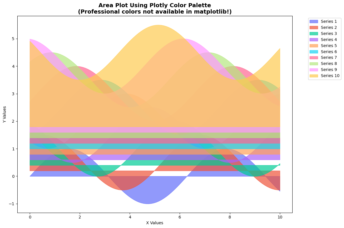
8. Matplotlib Compatibility
The Key Advantage: chromo-map gradients are fully compatible with matplotlib! This means you can use professional color palettes from Plotly and Palettable in your matplotlib plots while gaining enhanced color manipulation features.
[14]:
import matplotlib.pyplot as plt
import numpy as np

# Get the Plotly qualitative palette (10 colors) - not available in matplotlib!
plotly_colors = cmaps.plotly_by_type['qualitative']['Plotly']

print(f"🎨 Using Plotly palette with {len(plotly_colors)} colors:")
plotly_colors
🎨 Using Plotly palette with 10 colors:
[14]:
[15]:
# Create sample data for area plot
x = np.linspace(0, 10, 100)
data = np.array([np.sin(x + i) + i*0.3 for i in range(len(plotly_colors))])

# Create area plot using each color from the Plotly palette
fig, ax = plt.subplots(figsize=(12, 8))
for i, series in enumerate(data):
    ax.fill_between(x, i*0.2, series + i*0.2,
                   color=plotly_colors[i].hex,
                   alpha=0.7, label=f'Series {i+1}')

ax.set_title('Area Plot Using Plotly Color Palette\n(Professional colors not available in matplotlib!)',
             fontsize=14, fontweight='bold')
ax.set_xlabel('X Values')
ax.set_ylabel('Y Values')
ax.legend(bbox_to_anchor=(1.05, 1), loc='upper left')
plt.tight_layout()
plt.show()
[16]:
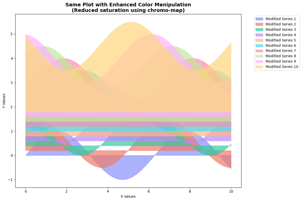
# Now demonstrate enhanced color manipulation - create a modified version
lightened_colors = plotly_colors.adjust_saturation(0.75)  # Reduce saturation by 25%

print("🎨 Modified palette (reduced saturation):")
lightened_colors
🎨 Modified palette (reduced saturation):
[16]:

[17]:
# Create another plot with the modified colors
fig, ax = plt.subplots(figsize=(12, 8))
for i, series in enumerate(data):
    ax.fill_between(x, i*0.2, series + i*0.2,
                   color=lightened_colors[i].hex,
                   alpha=0.7, label=f'Modified Series {i+1}')

ax.set_title('Same Plot with Enhanced Color Manipulation\n(Reduced saturation using chromo-map)',
             fontsize=14, fontweight='bold')
ax.set_xlabel('X Values')
ax.set_ylabel('Y Values')
ax.legend(bbox_to_anchor=(1.05, 1), loc='upper left')
plt.tight_layout()
plt.show()
[18]:
# Demonstrate using chromo-map gradients as matplotlib colormaps
viridis_plotly = cmaps.plotly_by_type['sequential']['Viridis']

# Create sample 2D data
x = np.linspace(-3, 3, 100)
y = np.linspace(-3, 3, 100)
X, Y = np.meshgrid(x, y)
Z = np.sin(np.sqrt(X**2 + Y**2))

# Use chromo-map gradient as matplotlib colormap
fig, (ax1, ax2) = plt.subplots(1, 2, figsize=(15, 6))

# Plot with chromo-map Viridis
im1 = ax1.imshow(Z, cmap=viridis_plotly, extent=[-3, 3, -3, 3])
ax1.set_title('Using chromo-map Viridis\n(Professional Plotly version)')
plt.colorbar(im1, ax=ax1, shrink=0.8)

# Plot with standard matplotlib viridis for comparison
im2 = ax2.imshow(Z, cmap='viridis', extent=[-3, 3, -3, 3])
ax2.set_title('Standard matplotlib viridis\n(For comparison)')
plt.colorbar(im2, ax=ax2, shrink=0.8)

plt.tight_layout()
plt.show()

print("🔬 Both plots use viridis, but chromo-map gives you access to the professional Plotly version!")
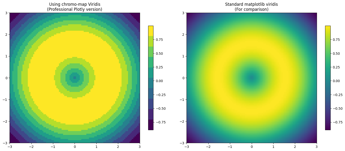
🔬 Both plots use viridis, but chromo-map gives you access to the professional Plotly version!